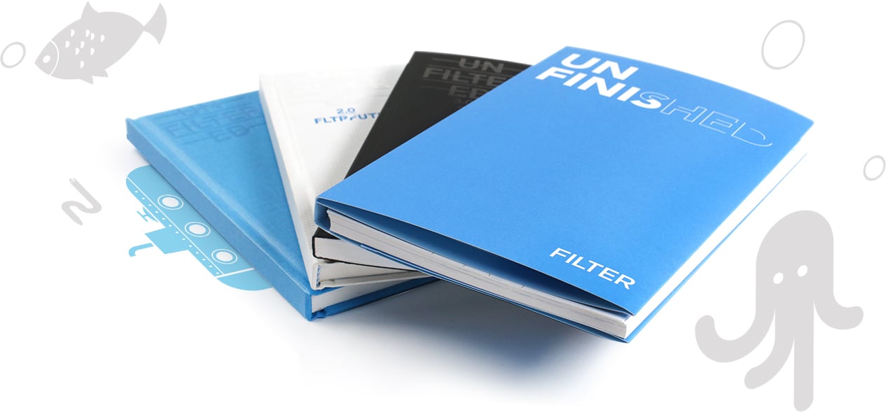
Filter Holiday Journal
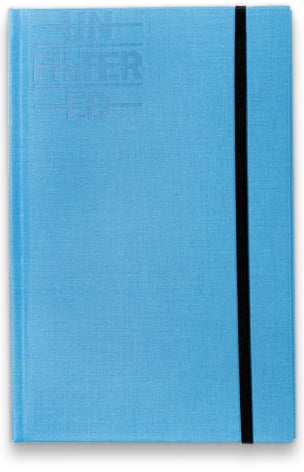
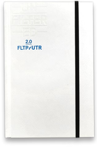
Changing up the fourth installation of Filter’s holiday journal was no easy thing to do. Previous versions of the journal had been beautifully designed by another agency and featured in Communications Arts Magazine. Due to budget restrictions, the 2013 journal had to be printed at a lower cost than previous years. This meant wire binding, recycled paper, and a new form factor. We also had to take the design in-house.
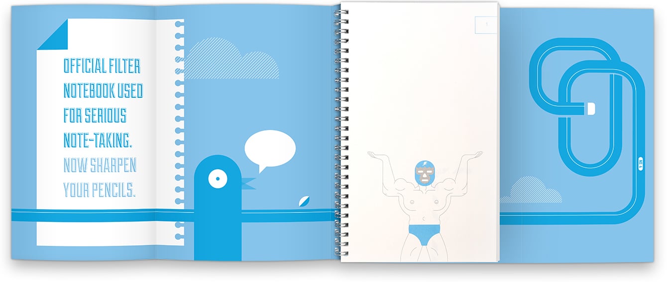
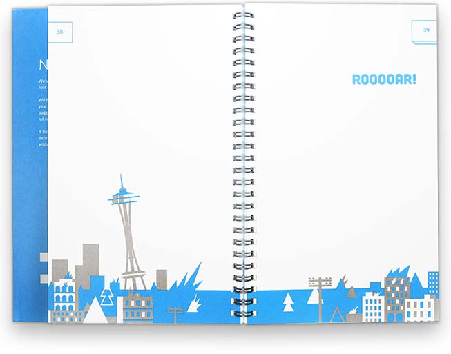
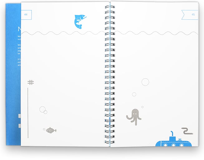
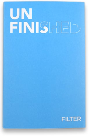
Because the form factor was different, we knew we could use that to our advantage. We needed a solution that allowed users to write, doodle, and draw so we decided on a sketchbook format. Working with illustrator Dan Schlitzkus, we created a book of unfinished doodles and sayings to represent Filter’s growth as a company. Allowing our clients, employees, and contractors to fill in the gaps was a playful way to introduce them to the beginnings of a new visual identity.